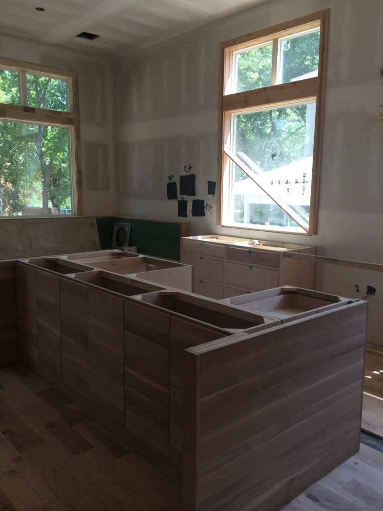
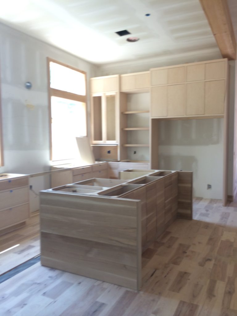
A small sneak peak of our upcoming Cottage kitchen…
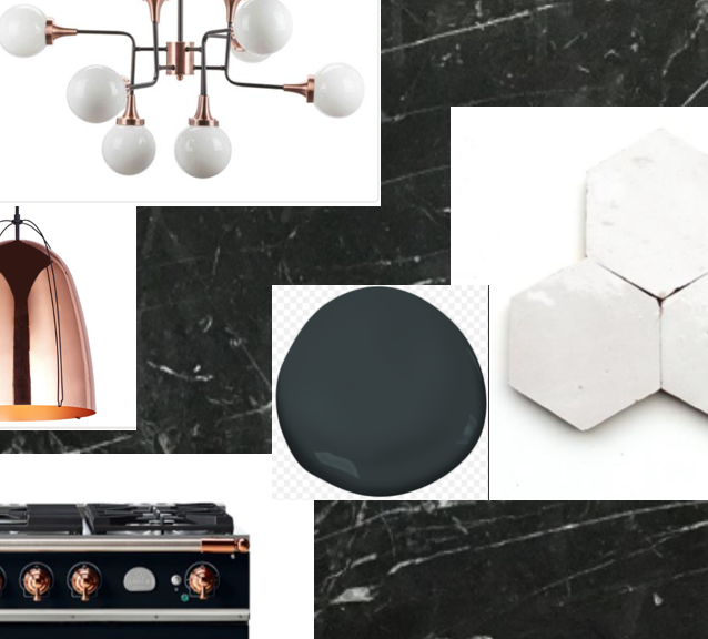
As I have been working on the new kitchen, it is making me lament our last kitchen. We love, love, love this kitchen. If you’ve been reading, you know that last year (2016) we finally built a house for us. Long story short, we ended up purchasing the cottage for us to renovate for our fam, and now our house is for sale. That’s the life, y’all.
But man, this kitchen is GOOOOOD. The windows, the euro feel, the… EVERYTHING. It is a great kitchen for entertaining, and a great kitchen for a family. So we are gonna run you through the whole thing!
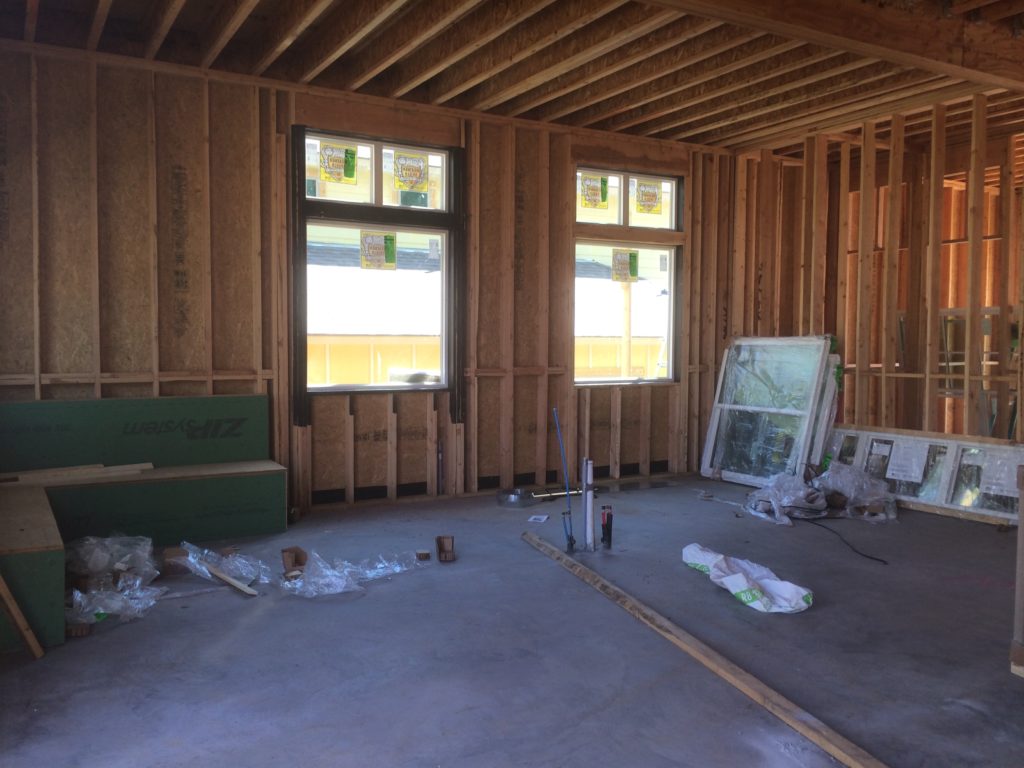
Here it is, all framed up–even the banquette is in place. Those windows prevented a lot of upper cabinets on that wall, but they were so worth it.
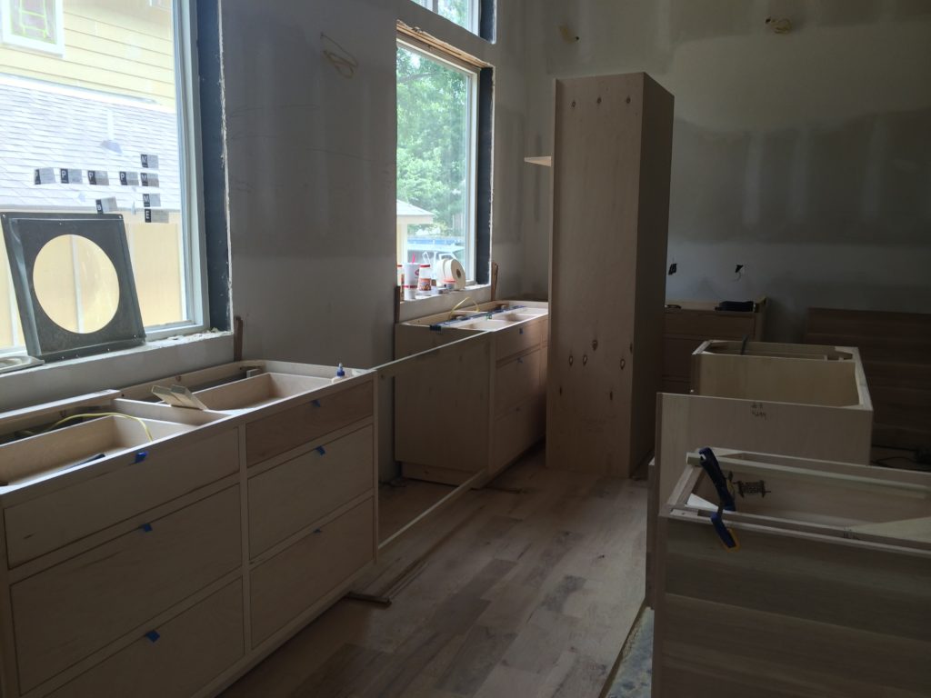
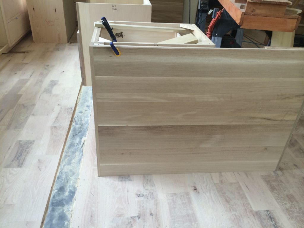
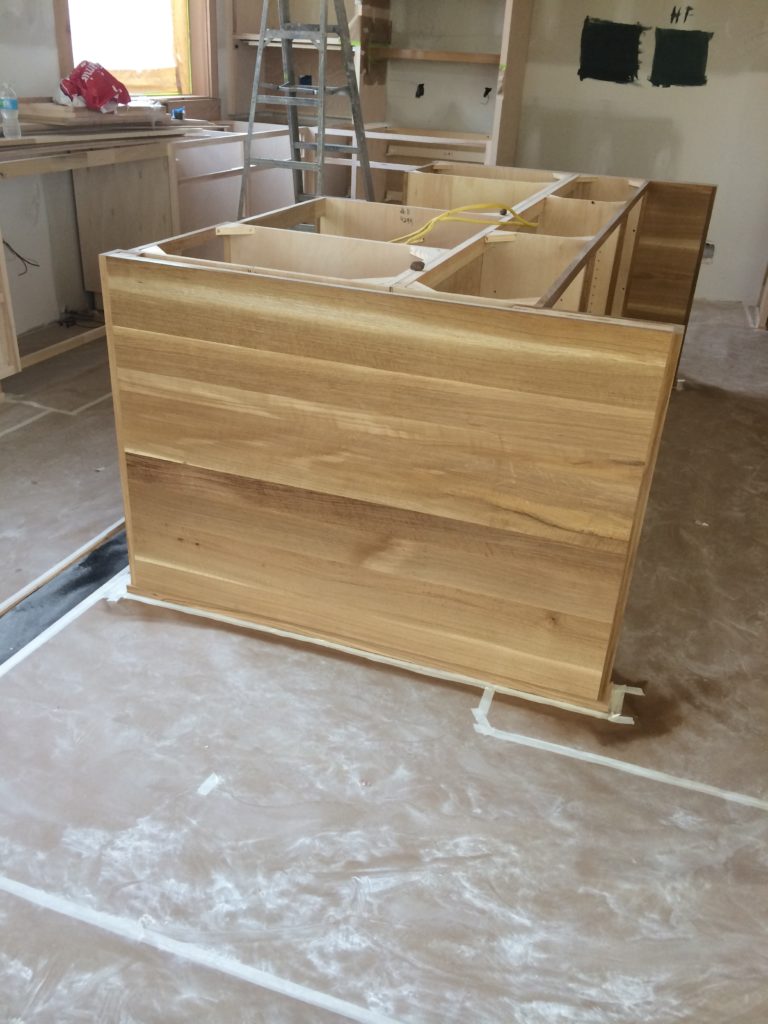
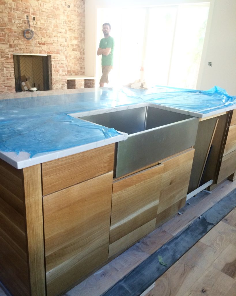
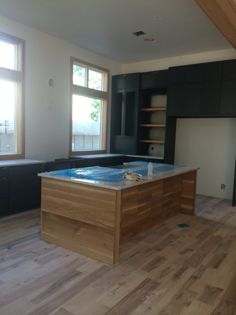
Woodstock Cabinets coming in hot!! Perimeter are paint grade, and the island is a rift sawn white oak. We wanted a kind of warmer Euro feel with the cabinets so high–you will see shortly, so we really wanted the impact of the saturated color on the cabinets…and I can’t say no to natural wood on an island. We were doing a lot of natural wood accents in this room, so the island was a major part of making the accents feel cohesive.
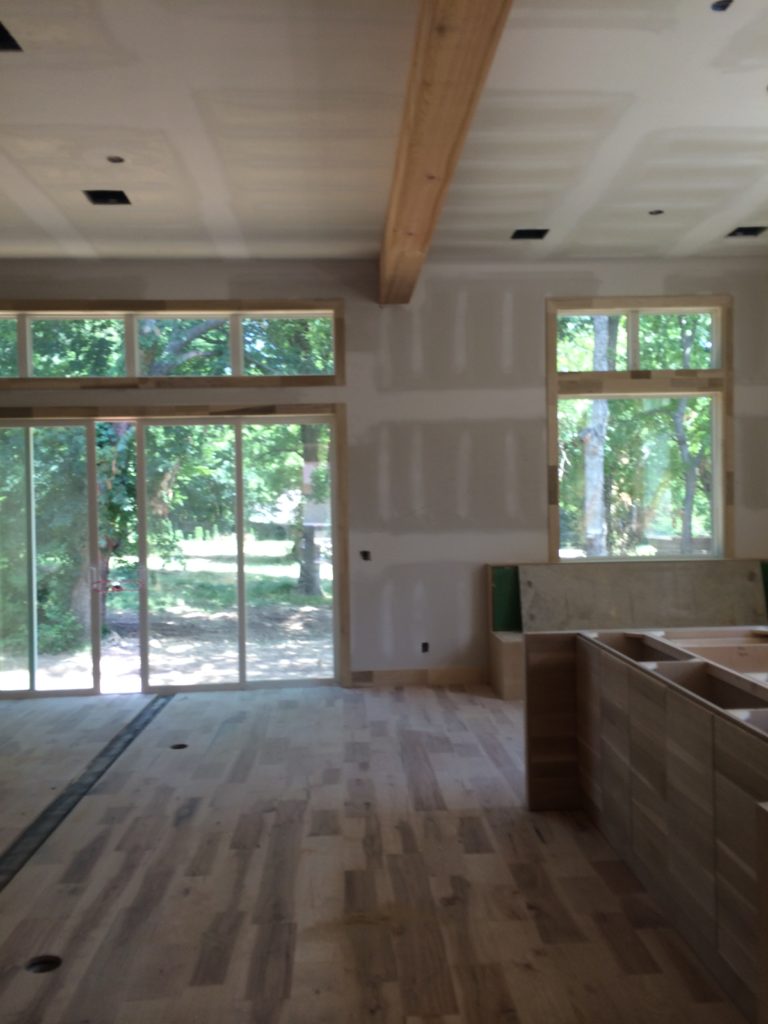
Like that cedar beam! Here is a view into the living/dining area, looking at those gorgeous sliders. So much natural light.
The windows in the kitchen were also wrapped with cedar to add to the natural wood accents.
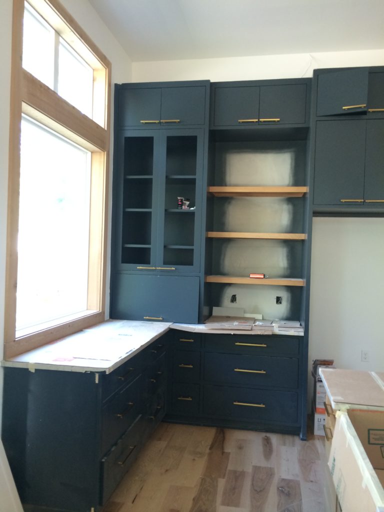
All cabinets in place and waiting on paint!!
The rift sawn white oak island just got a clear coat–I LOVE the natural color of the wood, and the natural grain.
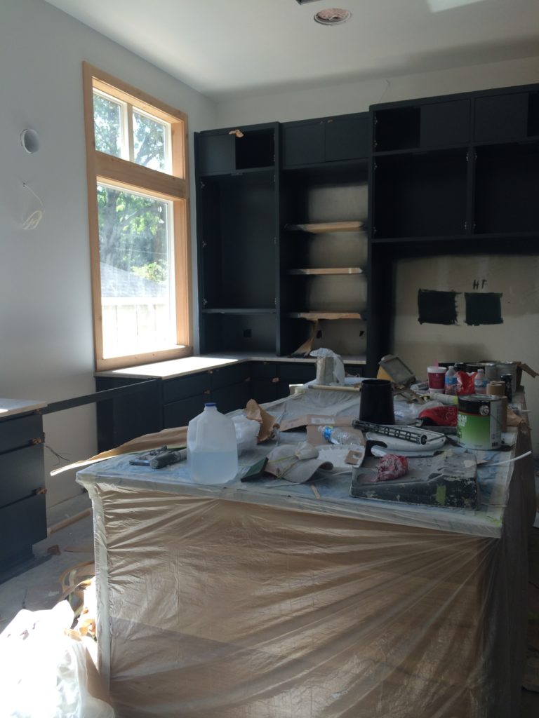
You can see a few paint samples in the refrigerator area. Again, we knew we wanted something really saturated that would make a big impact. I love a white kitchen, and do them from time to time (one of our all-time fave kitchens right here), but I am always trying to think about how our homes will be used. Since we mostly build houses with 4-5 bedrooms, it is my assumption that families will be using our homes, and will want them to be as functional as they are beautiful. My children run around ALL THE TIME with colors, and food, and STUFF…stuff that marks up, splatters, and maims gorgeous white cabinets. Of course they can be wiped down, but I wanted to see how going dark blue/green would work for us!
Looks super dark here, but I couldn’t have been more pleased with the color!!
Clark, surveying the kitchen from the living room. That is a full vintage-brick wall right there, and it is MY JAM. They tore that brick off an old school house in OKC…or at least that was the story they told me, and I am stickin’ to it!
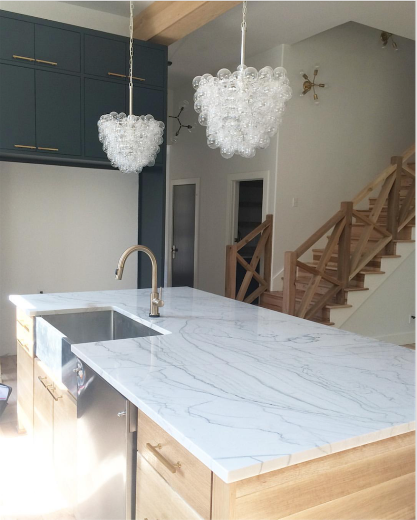
I surprisingly never took a picture of our quartzite in the stoneyard, but here it is on the island…
We LOVED how it looked like a pencil sketch that was just slightly geographical. I will talk more about quartzite in the reveal!
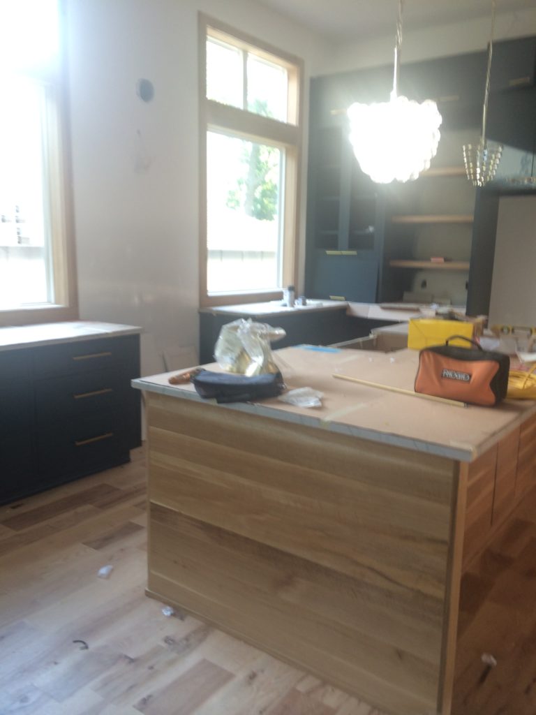
Better shot with the light here–more indicative of the cabinet color. See guys?? Color REALLY, REALLY depends on the light!
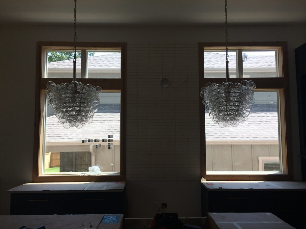
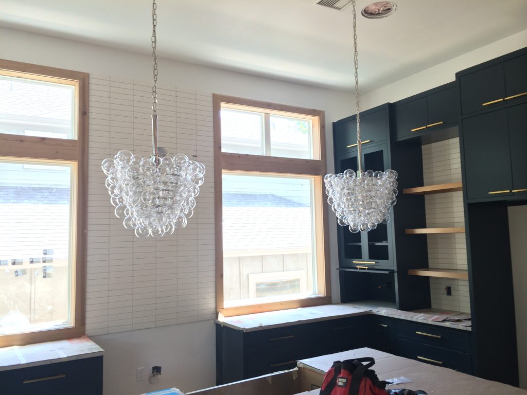
Speaking of light, those fab pendants going in…the light just SEARED through those glass bubbles at certain times of day, so those pendants basically glowed. It was a really neat, totally unexpected benefit of putting those light fixtures there!
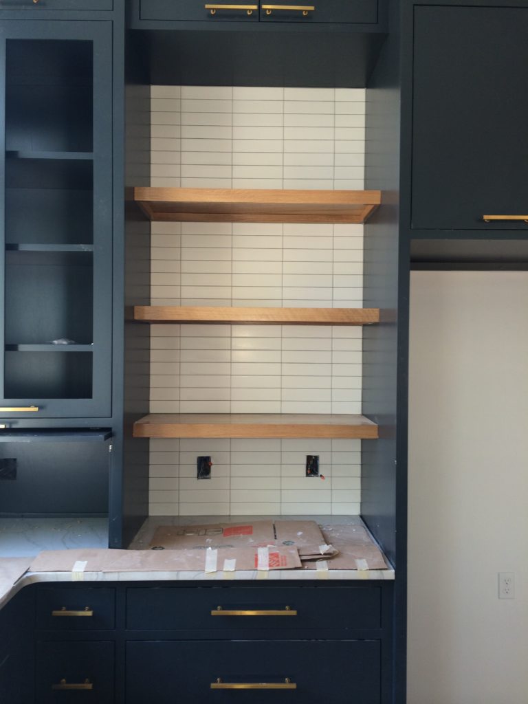
Backsplash in. I had a completely different backsplash picked out, but once I saw our quartzite laid down, the cabinet color, and the vintage brick wall in the living room, I wanted something simple and clean. These are matte white 2×8 subway tiles in a straight lay.
Almost complete!!! Stay tuned for ALLLLLLL the pics of this kitchen in the next post, and all the sources too!

